
Responsive Slick Slider
Hello guys and welcome to Code2Night! In this tutorial, we're going to delve into the world of web development and explore the amazing capabilities of the Responsive Slick Slider. If you're looking to create a visually stunning and responsive image gallery, you've come to the right place.
Slick Slider is a popular jQuery plugin that allows you to showcase images, videos, and other content in a sleek and interactive manner. Its flexibility and ease of use make it a go-to choice for developers and designers alike. In this tutorial, we'll be focusing on configuring Slick Slider specifically for responsive screens.
With the ever-increasing use of mobile devices and varying screen sizes, it's crucial to ensure that your website or application adapts seamlessly to different devices. By utilizing Slick Slider's responsive mode, we can create a gallery that not only looks great on desktops but also adjusts beautifully on mobile devices, tablets, and everything in between.
Throughout this tutorial, we'll guide you step by step on how to set up and configure Slick Slider for responsive screens. We'll cover topics such as installation, initialization, customization, and optimizing the slider for different breakpoints. By the end of this tutorial, you'll have the knowledge and skills to create your own stunning and responsive image gallery using Slick Slider.
Whether you're a beginner in web development or an experienced coder looking to add a touch of interactivity to your projects, this tutorial is for you. So, let's dive in and discover the power of Slick Slider in responsive mode. Get ready to create an engaging user experience that captivates your audience across all devices!
Responsive Slick Slider
The slick slider can be configured to work responsively as per the screen size. You can manage it to show a different number of slides on different screen sizes. We will see how to do that.
So first of all add these cdn's in your project layout page.
Step 1: Online Cdn of Jquery and Slick
<script type="text/javascript" src="//code.jquery.com/jquery-1.11.0.min.js"></script>
    <script src="https://cdnjs.cloudflare.com/ajax/libs/slick-carousel/1.8.1/slick.min.js"></script>
    <link href="https://cdnjs.cloudflare.com/ajax/libs/slick-carousel/1.8.1/slick.css" rel="stylesheet" />
    <link href="https://cdnjs.cloudflare.com/ajax/libs/slick-carousel/1.8.1/slick-theme.css" rel="stylesheet" />
Step 2: Script For Slick Slider
After adding the CDNs to the layout page we have to add the script to initialize slick in responsive mode. We will add breakdown points in the responsive array and we will mention a number of slides that we want to show for that case.
<script>
        $(document).ready(function () {
            $('.slider').slick({
                slidesToShow: 4,
                slidesToScroll:4,
                dots: true,
                infinite: true,
                cssEase: 'linear',
                arrow: true,
                responsive: [
                    {
                        breakpoint: 1024,
                        settings: {
                            slidesToShow: 3,
                            slidesToScroll: 3,
                            infinite: true,
                            dots: true
                        }
                    },
                    {
                        breakpoint: 600,
                        settings: {
                            slidesToShow: 2,
                            slidesToScroll: 2
                        }
                    },
                    {
                        breakpoint: 480,
                        settings: {
                            slidesToShow: 1,
                            slidesToScroll: 1
                        }
                    }
                ]
            });
        });
    </script>
Step 3: Html Code
Now we will add some images to our HTML page. Then we will initialize that as a slick slider. You can copy the images from here to show the slider.
<div class="slider">
            <div>
                <img src="http://kenwheeler.github.io/slick/img/fonz1.png" />
            </div>
            <div>
                <img src="http://kenwheeler.github.io/slick/img/fonz2.png" />
            </div>
            <div>
                <img src="http://kenwheeler.github.io/slick/img/fonz3.png" />
            </div>
            <div>
                <img src="http://kenwheeler.github.io/slick/img/fonz1.png" />
            </div>
            <div>
                <img src="http://kenwheeler.github.io/slick/img/fonz2.png" />
            </div>
            <div>
                <img src="http://kenwheeler.github.io/slick/img/fonz3.png" />
            </div>
        </div>
Step 4: Complete the Code Of Html And Script
This is the complete view that you should have to create your responsive slick slider. You have to remember to put your script in the correct order to make it work.
@{
    ViewBag.Title = "Home Page";
}
<html>
<head>
    <style>
        .slider {
            width: 650px;
            margin: 0 auto;
        }

        img {
            width: 200px;
            height: 200px;
        }
        .slick-prev:before, .slick-next:before {
            font-family: 'slick';
            font-size: 20px;
            line-height: 1;
            opacity: .75;
            color: gray !important;
            -webkit-font-smoothing: antialiased;
            -moz-osx-font-smoothing: grayscale;
        }

    </style>


</head>
<body style="margin-top: 62px !important;">
    <div class="row">
        <div class="slider">
            <div>
                <img src="http://kenwheeler.github.io/slick/img/fonz1.png" />
            </div>
            <div>
                <img src="http://kenwheeler.github.io/slick/img/fonz2.png" />
            </div>
            <div>
                <img src="http://kenwheeler.github.io/slick/img/fonz3.png" />
            </div>
            <div>
                <img src="http://kenwheeler.github.io/slick/img/fonz1.png" />
            </div>
            <div>
                <img src="http://kenwheeler.github.io/slick/img/fonz2.png" />
            </div>
            <div>
                <img src="http://kenwheeler.github.io/slick/img/fonz3.png" />
            </div>
        </div>
    </div>

    <script type="text/javascript" src="//code.jquery.com/jquery-1.11.0.min.js"></script>
    <script src="https://cdnjs.cloudflare.com/ajax/libs/slick-carousel/1.8.1/slick.min.js"></script>
    <link href="https://cdnjs.cloudflare.com/ajax/libs/slick-carousel/1.8.1/slick.css" rel="stylesheet" />
    <link href="https://cdnjs.cloudflare.com/ajax/libs/slick-carousel/1.8.1/slick-theme.css" rel="stylesheet" />
    <script>
        $(document).ready(function () {
            $('.slider').slick({
                slidesToShow: 4,
                slidesToScroll:4,
                dots: true,
                infinite: true,
                cssEase: 'linear',
                arrow: true,
                responsive: [
                    {
                        breakpoint: 1024,
                        settings: {
                            slidesToShow: 3,
                            slidesToScroll: 3,
                            infinite: true,
                            dots: true
                        }
                    },
                    {
                        breakpoint: 600,
                        settings: {
                            slidesToShow: 2,
                            slidesToScroll: 2
                        }
                    },
                    {
                        breakpoint: 480,
                        settings: {
                            slidesToShow: 1,
                            slidesToScroll: 1
                        }
                    }
                ]
            });
        });
    </script>

</body>
</html>
Step 5: Now run the application
Now run your application and you will see a slick slider initialized with 4 slides. Now try to reduce the screen width and you will see at one point it will break down to 3 images and if you keep reducing the width it will start showing 2 slides.
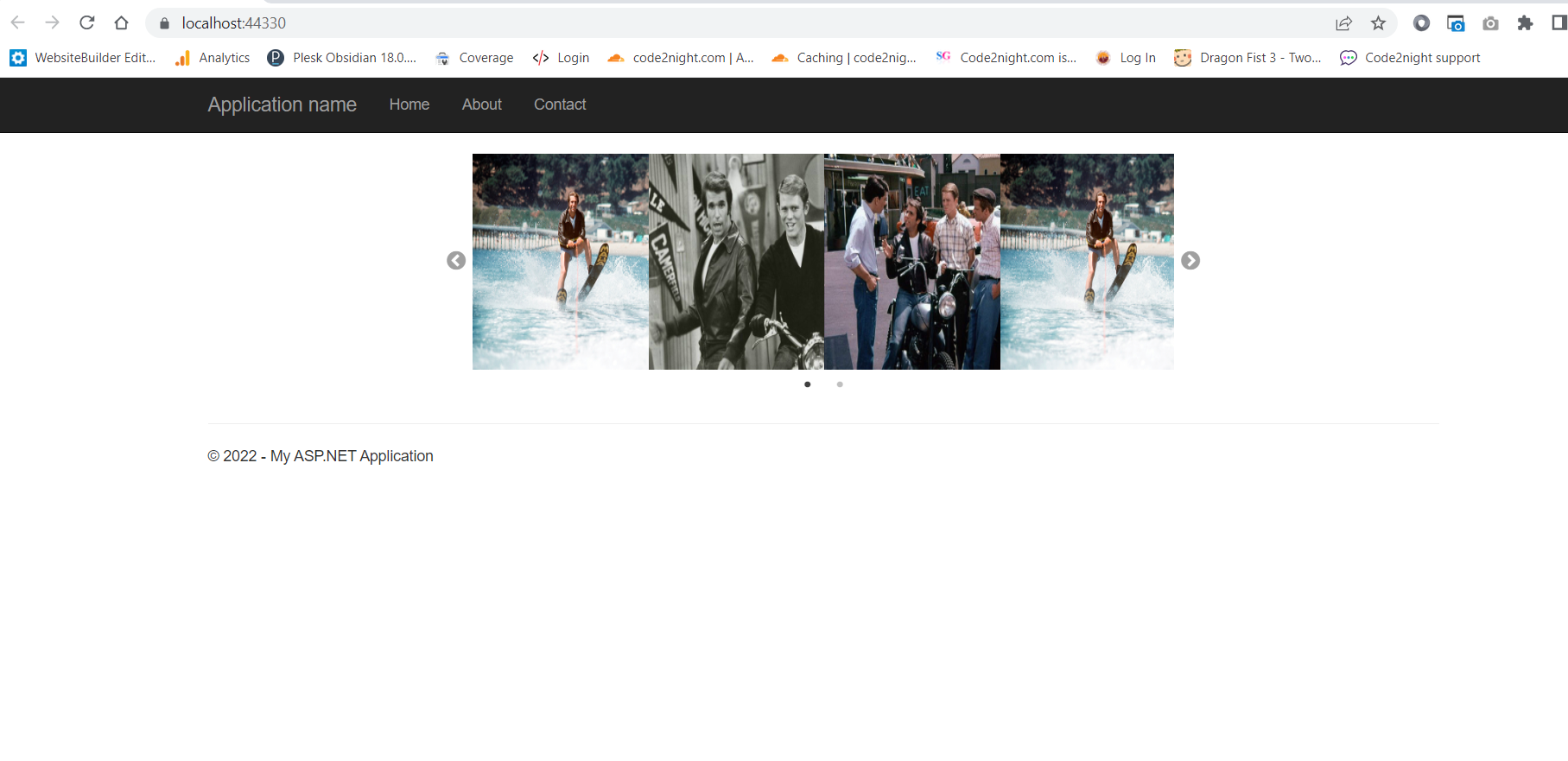 Here we can see 4 slides as the screen is showing up to full width
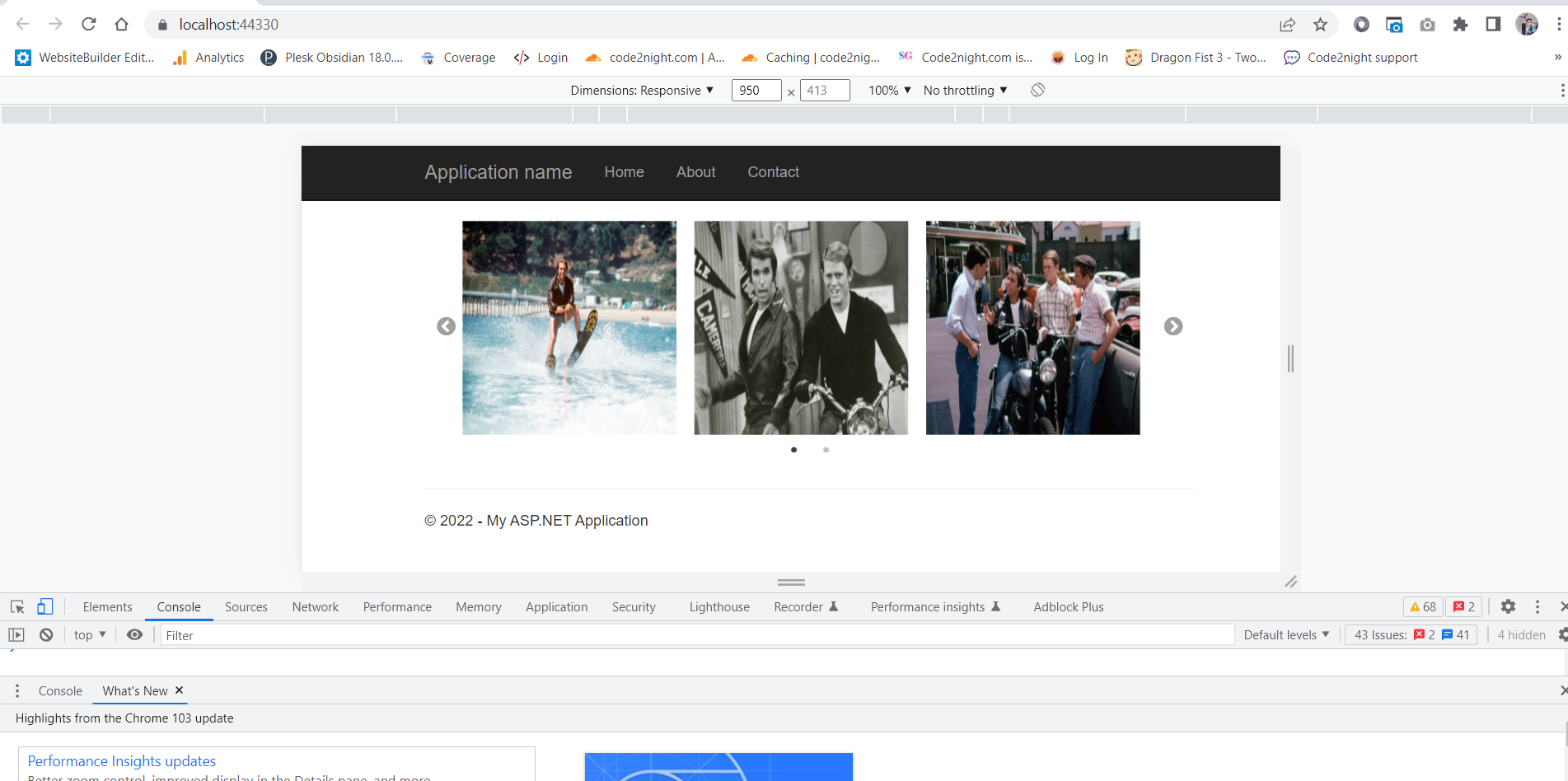
Here you can see 3 slides per screen, as the width is reduced from the full window
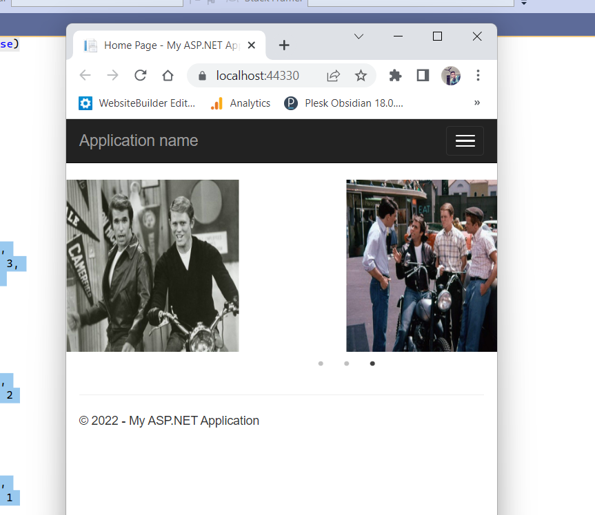
Here you can see 2 images are visible in the slider as the width is reduced to less size.
So you can notice the slider changing its slides as per the device width. So this is how you can create a responsive slick slider in Asp.Net.
