Angular Material Select Dropdown with Image
Overview of Angular Material Select Dropdown
The Angular Material Select Dropdown is a powerful UI component that allows users to select options from a list. By incorporating images into the dropdown, we can provide a richer visual experience. This is especially beneficial in applications where users need to choose from a variety of categories or items that can be better represented visually.
Real-world applications of this feature include e-commerce platforms where products can be categorized, or content management systems where users can select tags or categories that are represented by icons or images. By using images, we can reduce cognitive load and improve the overall usability of the interface.

Prerequisites
Before we begin, ensure you have the following prerequisites installed:
- Node.js - This is required to run Angular applications. Ensure you have a version compatible with Angular.
- Angular CLI - Install it globally using
npm install -g @angular/cli. - Angular Material - We will install this as part of our application setup.
Step 1: Create New Angular Application
To create a new Angular application, use the Angular CLI command:
ng new app-materialThis command will generate a new Angular application named app-material with all necessary files and folders.
Step 2: Add Angular Material
Next, we need to install Angular Material in our application. This library provides a collection of UI components that follow Material Design principles. To install, run:
ng add @angular/materialDuring this process, you may be prompted to choose a theme and set up global typography styles. Choose options that suit your application.
Step 3: Import Required Modules
After installing Angular Material, we need to import the necessary modules into our application. Open the app.module.ts file and add the following imports:
import { NgModule } from '@angular/core';
import { BrowserModule } from '@angular/platform-browser';
import { AppRoutingModule } from './app-routing.module';
import { AppComponent } from './app.component';
import { FormsModule } from '@angular/forms';
import { MatSelectModule, MatFormFieldModule } from '@angular/material';
import { BrowserAnimationsModule } from '@angular/platform-browser/animations';
import { DropdownComponent } from './dropdown/dropdown.component';
@NgModule({
declarations: [
AppComponent,
DropdownComponent
],
imports: [
BrowserModule,
AppRoutingModule,
FormsModule,
MatSelectModule,
MatFormFieldModule,
BrowserAnimationsModule
],
providers: [],
bootstrap: [AppComponent]
})
export class AppModule {}Step 4: Create a New Component
Next, we will create a new component for our dropdown. Use the Angular CLI to generate the component:
ng g c dropdownThis command creates a new folder named dropdown with the component files inside. Now, we need to update the HTML template file for this component.
Step 5: Update the HTML Template
Open the dropdown.component.html file and replace its content with the following code:
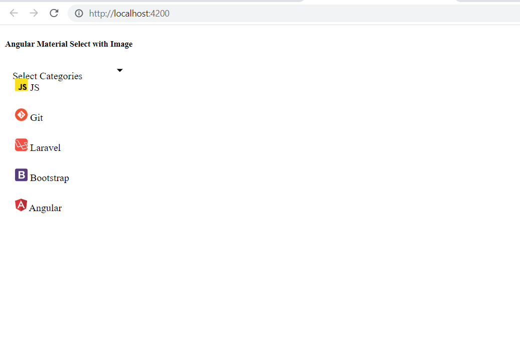
<div class="container">
<h4>Angular Material Select with Image Example</h4>
<mat-form-field appearance="fill">
<mat-select placeholder="Select Categories">
<mat-option *ngFor="let category of categories" [value]="category.id">
<img width="20" height="20" [src]="category.image"> {{category.value}} </mat-option>
</mat-select>
</mat-form-field>
</div>This code sets up a Material Design form field with a select dropdown that iterates over the categories array.
Step 6: Update the TypeScript File
Now, we need to define our data model and populate the categories in the dropdown.component.ts file:
import { Component, OnInit } from '@angular/core';
interface Category {
id: string;
value: string;
image: string;
}
@Component({
selector: 'app-dropdown',
templateUrl: './dropdown.component.html',
styleUrls: ['./dropdown.component.scss']
})
export class DropdownComponent implements OnInit {
categories: Category[] = [
{ id: '1', value: 'JS', image: 'https://www.itsolutionstuff.com/category-images/javascript.svg' },
{ id: '2', value: 'Git', image: 'https://www.itsolutionstuff.com/category-images/git.png' },
{ id: '3', value: 'Laravel', image: 'https://www.itsolutionstuff.com/category-images/laravel.svg' },
{ id: '4', value: 'Bootstrap', image: 'https://www.itsolutionstuff.com/category-images/bootstrap.svg' },
{ id: '5', value: 'Angular', image: 'https://www.itsolutionstuff.com/category-images/angular.svg' }
];
constructor() { }
ngOnInit(): void { }
}Here, we define an interface for our categories and populate it with example data.
Step 7: Include the Dropdown Component in App Component
Finally, we need to include our dropdown component in the main application component. Open the app.component.html file and add the following line:
<app-dropdown></app-dropdown>Step 8: Run the Angular Application
All the required steps have been completed. To run the Angular application, execute the following command:
ng serve --openThis command will start the development server and open your application in a web browser at http://localhost:4200. You should see your Angular Material Select Dropdown with images rendered correctly.
Edge Cases & Gotchas
When implementing Angular Material Select Dropdowns with images, be aware of the following edge cases:
- Image Loading: Ensure that the images used are properly optimized to avoid slow loading times. Consider using placeholders while images load.
- Accessibility: Always ensure that your dropdown is accessible. Use appropriate ARIA roles and labels to enhance usability for screen readers.
- Responsive Design: Test the dropdown on various screen sizes to ensure that images scale appropriately and do not disrupt the layout.
Performance & Best Practices
To ensure optimal performance and usability, follow these best practices:
- Lazy Loading: Consider lazy loading images to improve initial load times, especially if you have a large number of categories.
- Consistent Image Sizes: Use images of consistent dimensions to maintain a uniform appearance in the dropdown.
- Use CSS for Styling: Instead of inline styles, use CSS classes to style your dropdown and images for better maintainability.
Conclusion
In this tutorial, we have learned how to create an Angular Material Select Dropdown that includes images. This enhances the user experience by providing a visual representation of options. Key takeaways include:
- Setting up Angular Material in your application is straightforward with the CLI.
- Creating a dropdown with images can significantly improve usability in applications.
- Always consider edge cases and best practices for performance and accessibility.